refreshing brand design
for Real LEDGE
Designing an updated brand manual for an educational non-profit in Honduras from a 'corporate' to a fresh and vibrant look that reflects the style of Gen-Z teenagers.
Role: UI Designer (contract)
Duration: 6 Months
Tools: Figma, Adobe Photoshop, Squarespace
the backstory
Real LEDGE, an educational non-profit in Honduras, offers entrepreneurial education to students, indigenous women, and migrants. With their organization growing, they're looking to revamp their brand manual to give their marketing materials and website a vibrant, contemporary appearance that resonates more effectively with their target audience, primarily teenagers, as their student division is the core of their mission.
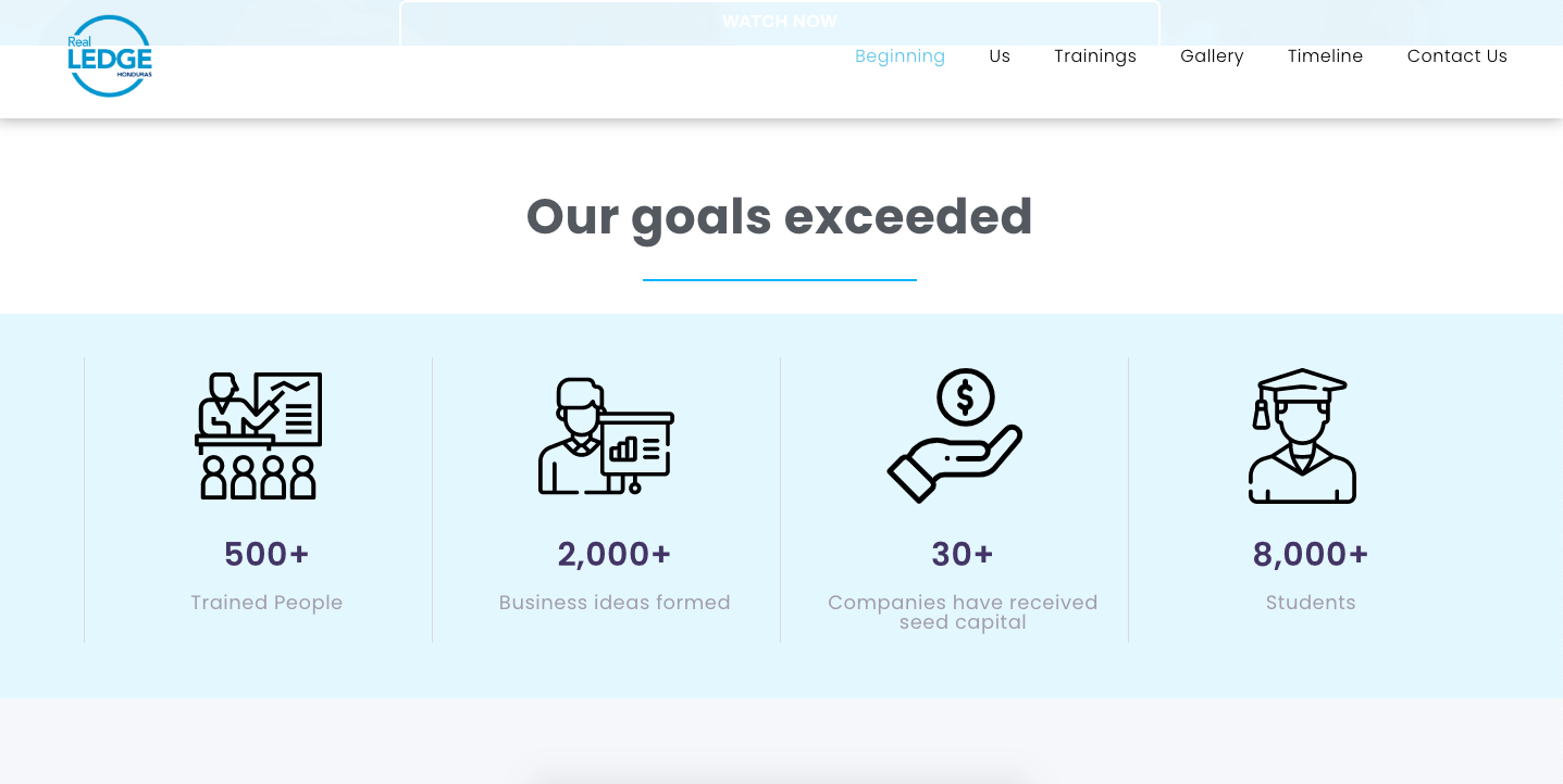
Current brand manual:
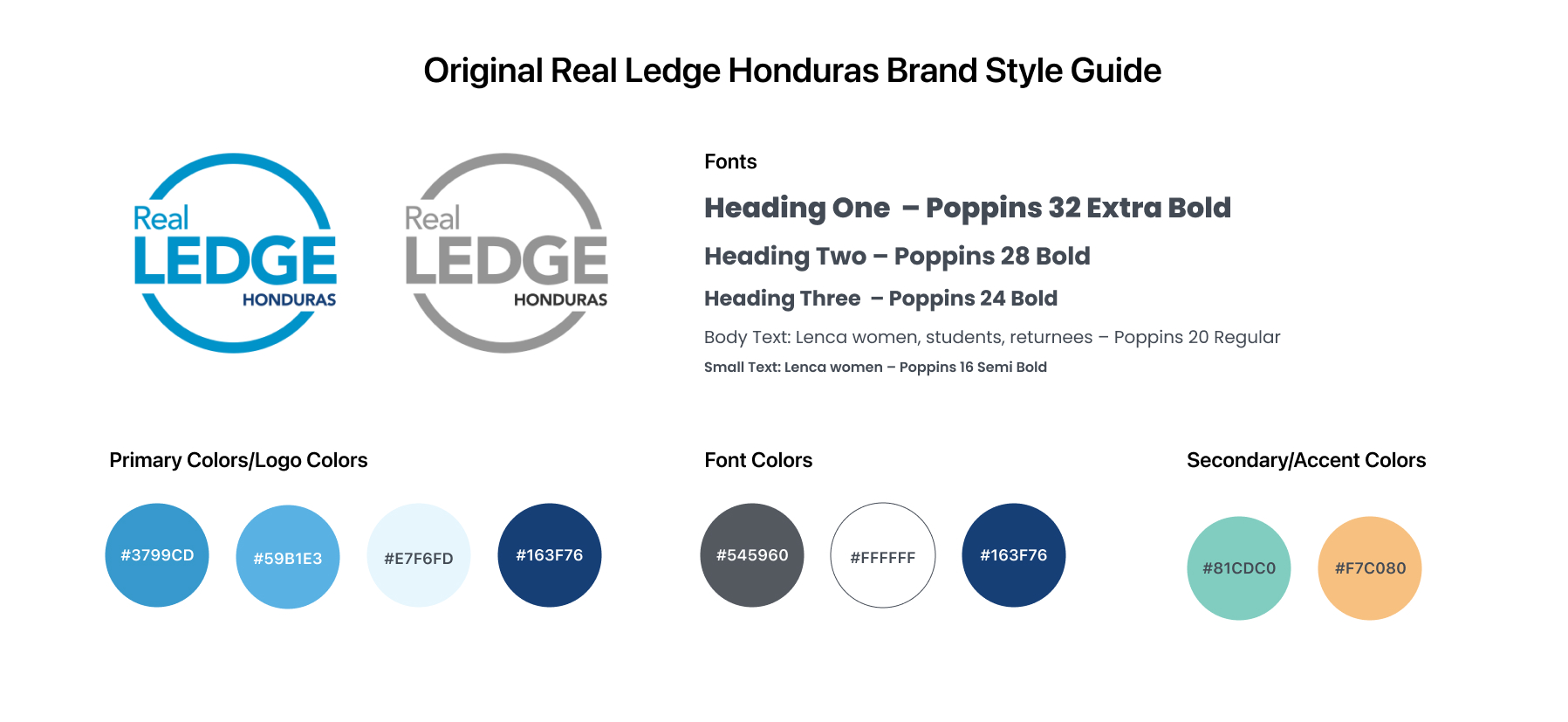
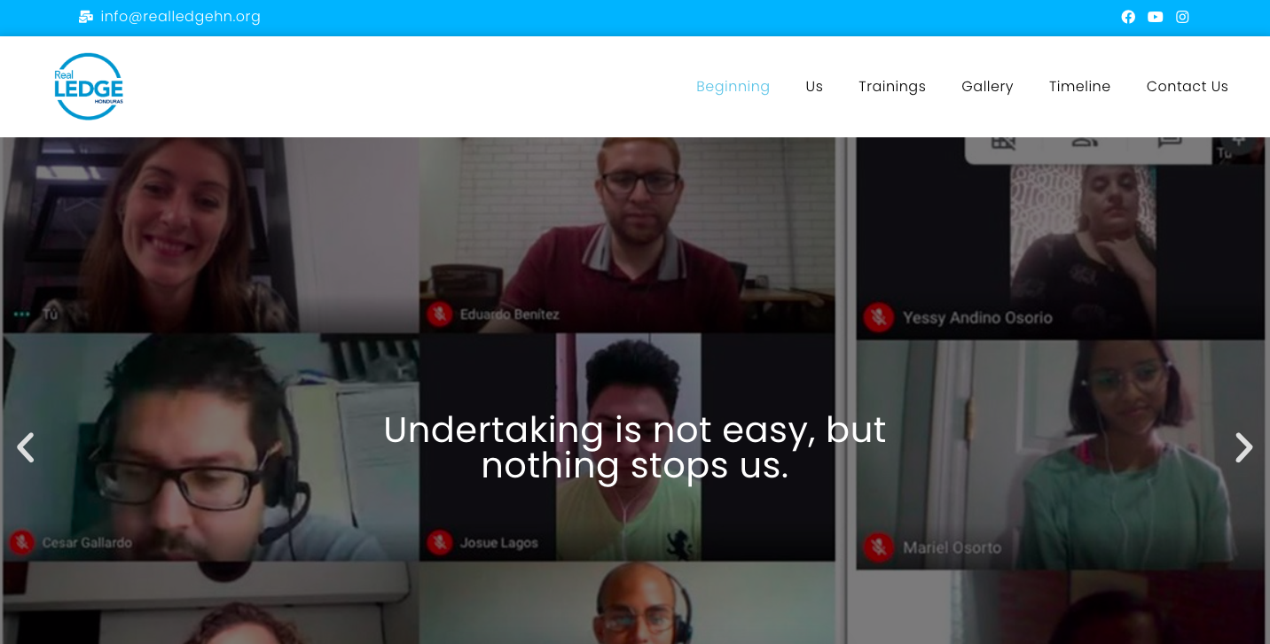
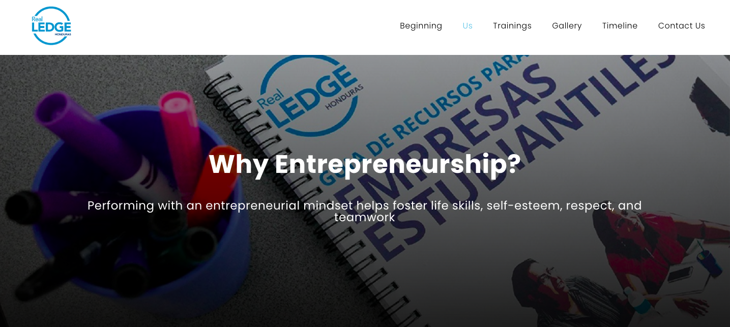
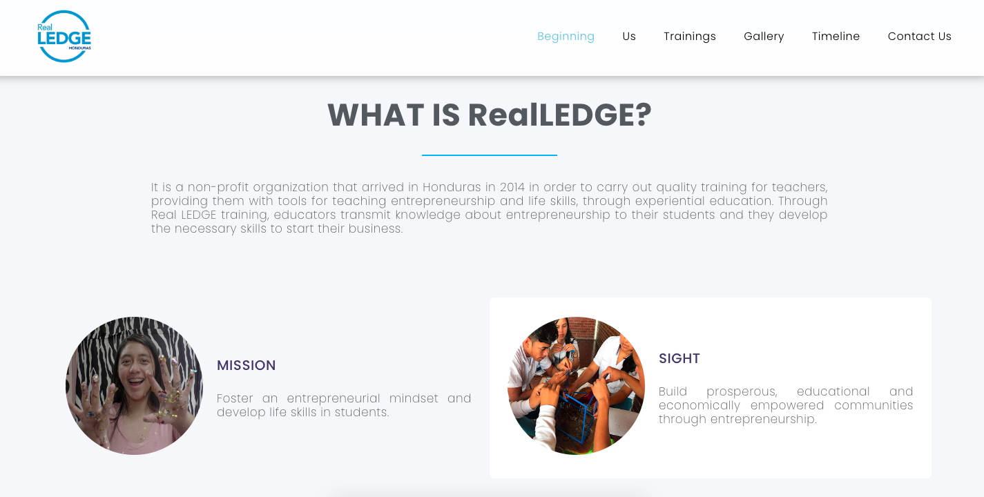
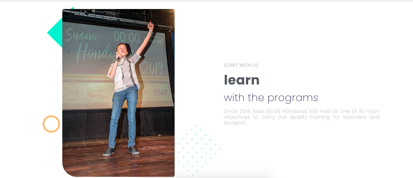
Original brand manual on website:
the minor conflict
Real LEDGE, with their constrained budget, needs all graphics, typography, and colors to be easily reproducible as they grow. They use Squarespace for their website, so the new designs need to work well within the constraints of Squarespace.
the process
In the initial design meetings discussing the project, the director of the organization had mentioned that she liked the look and feel of collage inspired mixed media graphics and colorful hues.
With the primary audience of Real LEDGE being gen-z high school students, I knew that incorportating color and a fun collage style was key in making the program more appealing to teenagers (no teen wants boring, corporte style guides when learning about money and business).
This prompted me to start creating my mood board, where I drew inspiration from collages but also elements reminiscent of Honduras - its verdant rainforests, picturesque bodies of water, and vibrant Latin influences.
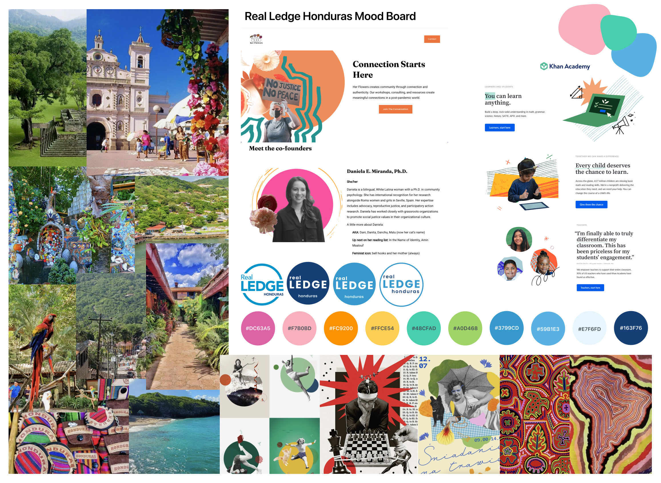
I created two style board options to present to Real LEDGE:
Option 1: Colorful
This board took inspiration from Latin American design & culture, with pinks and oranges to compliment the NGO's logo blue.
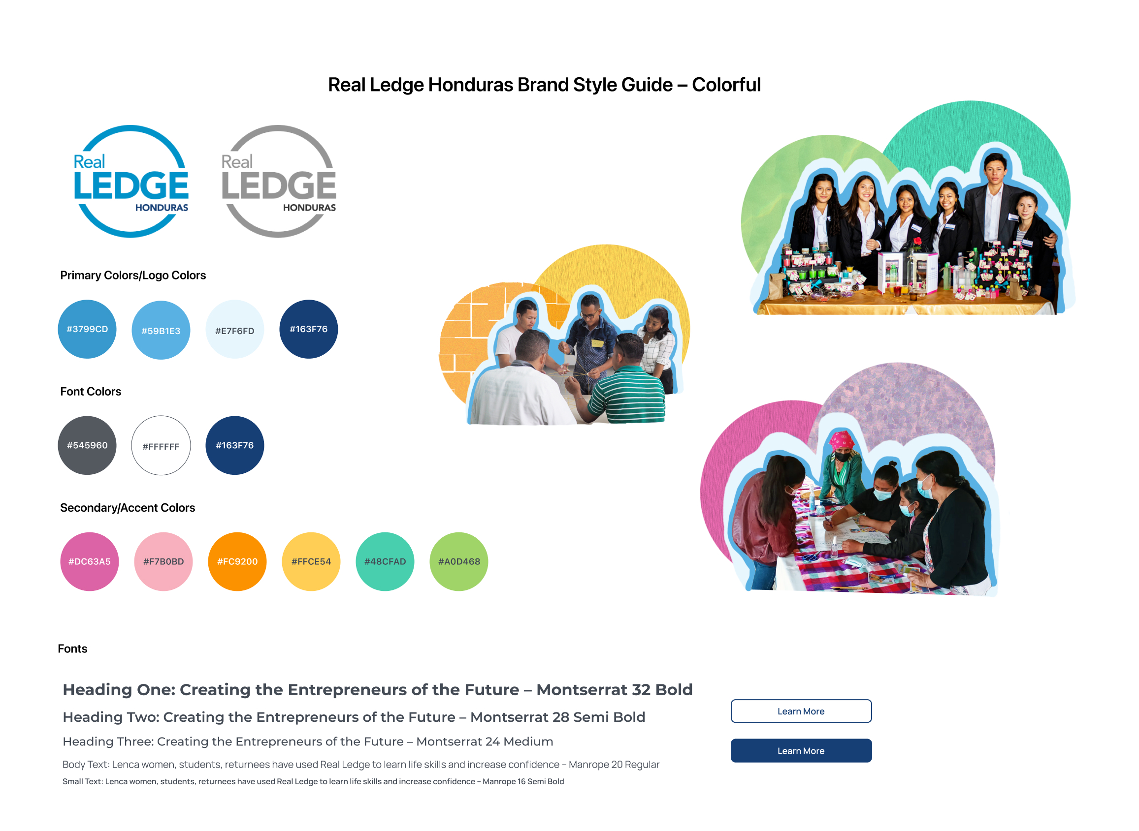
Option 2: Cold Tones
This board drew further inspiration from the natural geography of Honduras, featuring greens and blues that not only accentuated the NGO's logo but also integrated color psychology. The blue hues are often associated with success and trust, while the green hues evoke safety, prosperity, and wealth.
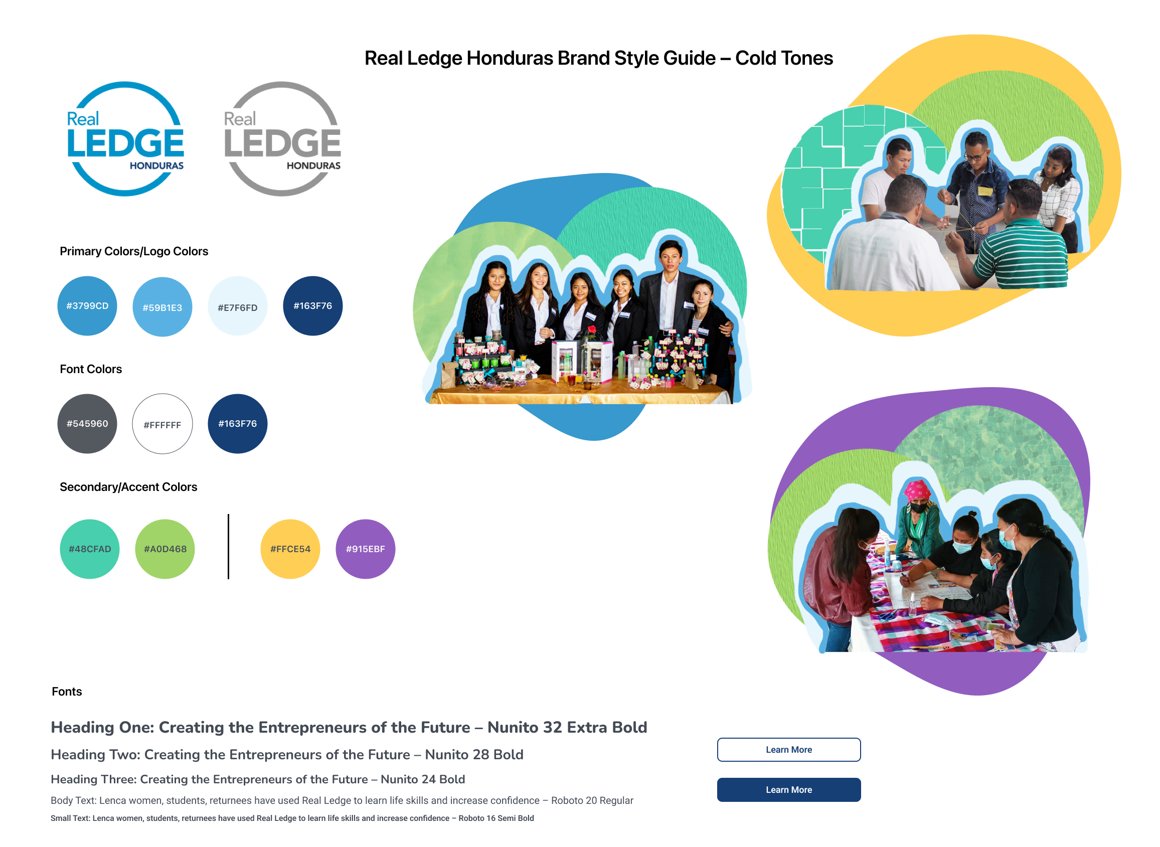
The Real LEDGE team decided to move forward with Option 2: Cold Tones as they felt that style closely represented their mission and would still feel recogonizable by the community without straying too far from their current brand manual.
the outcome
Once the Real LEDGE team decided on Option 2: Cold Tones, I started to work on completing the brand manual/guide, incorpotating the elements that they requested, including:
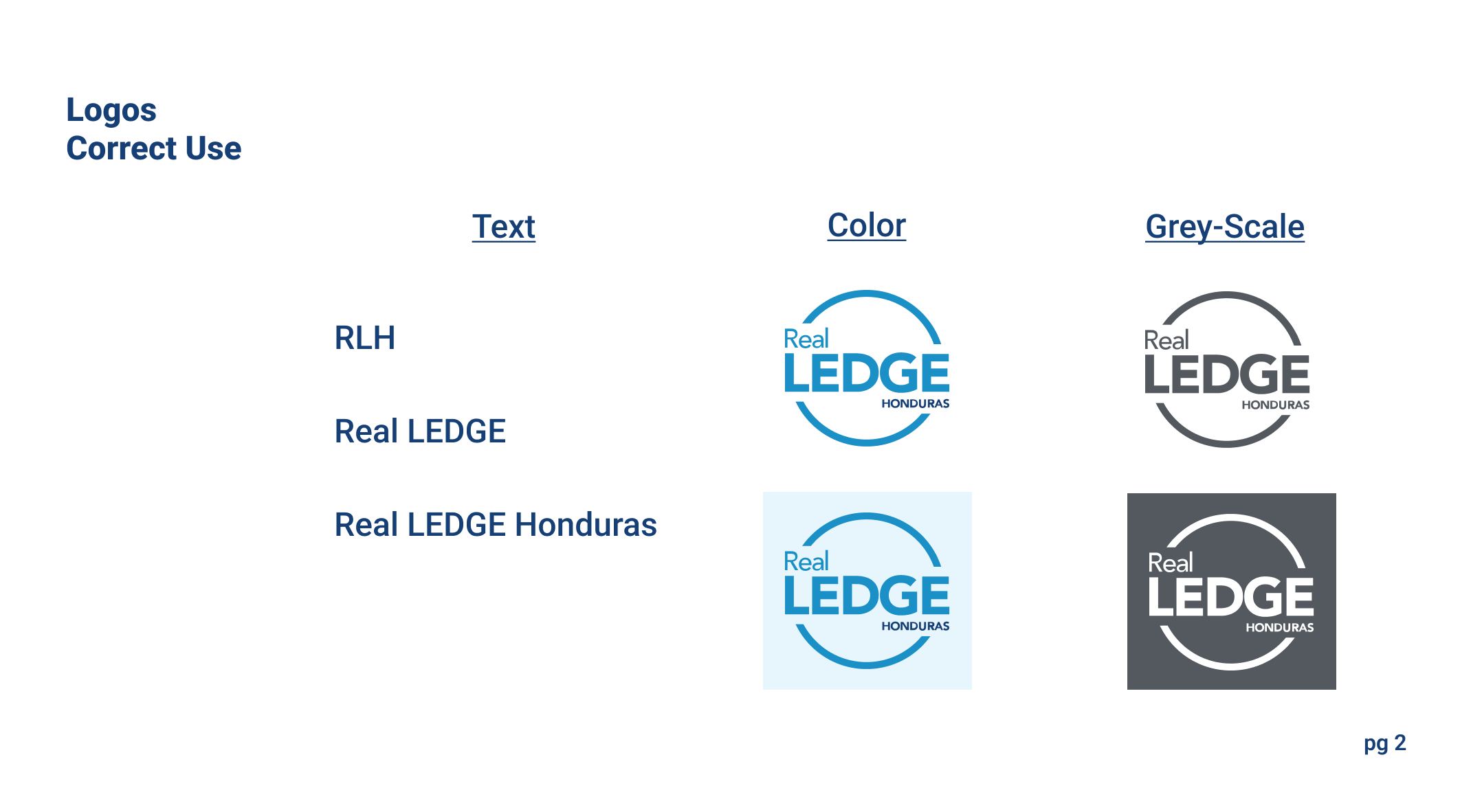
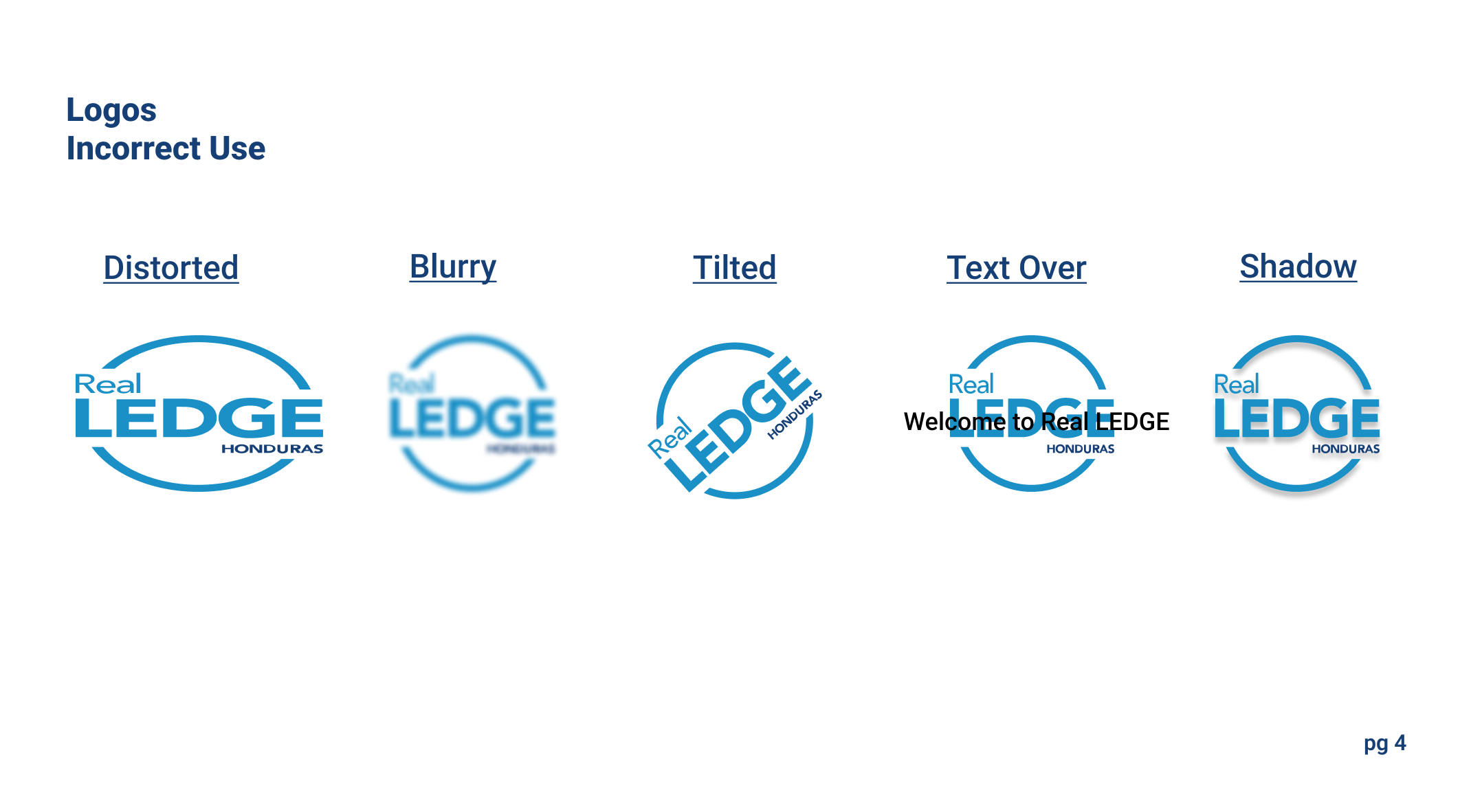
- Logo (and use cases)
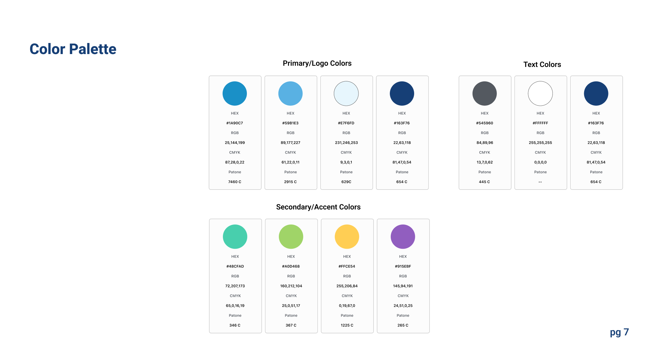
- Colors (main and secondary)
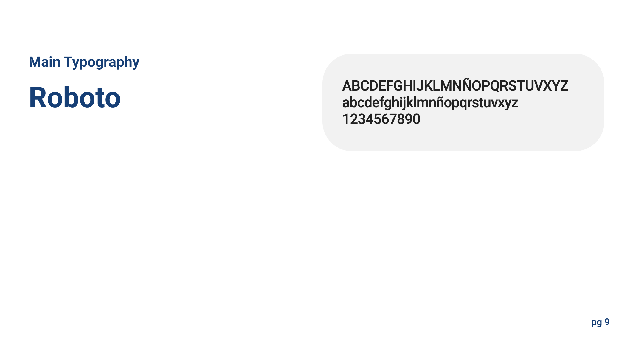
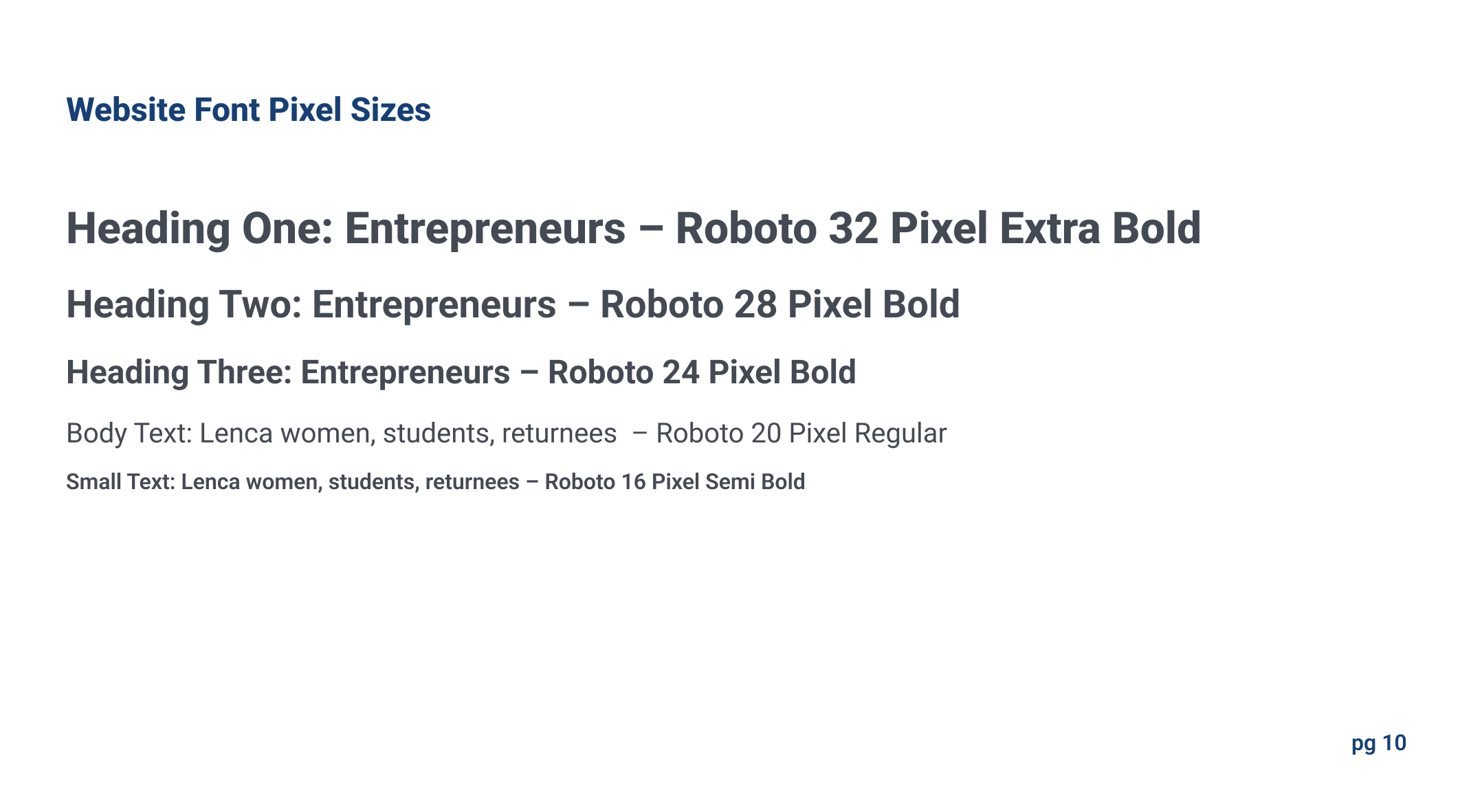
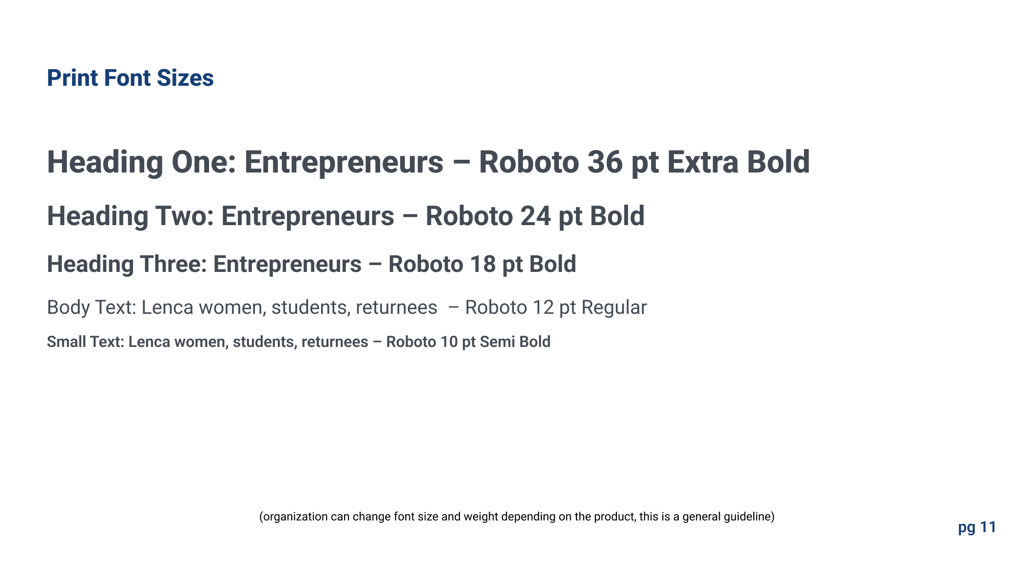
- Typography
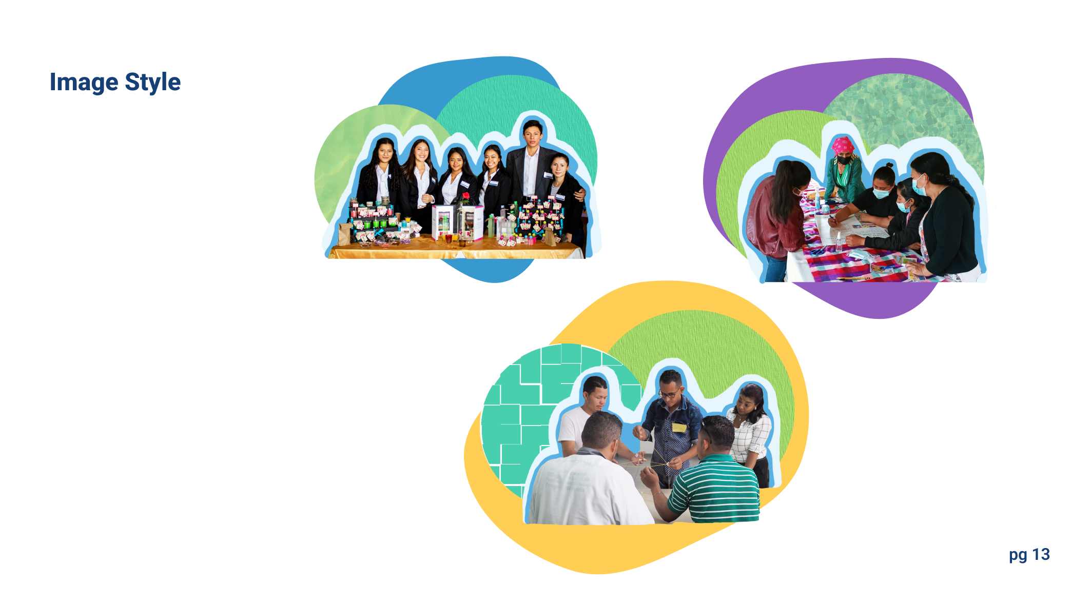
- Image style
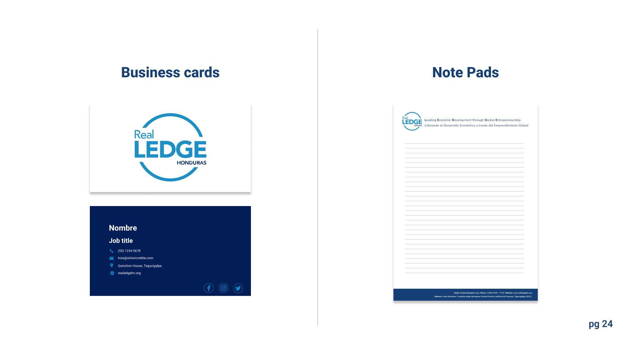
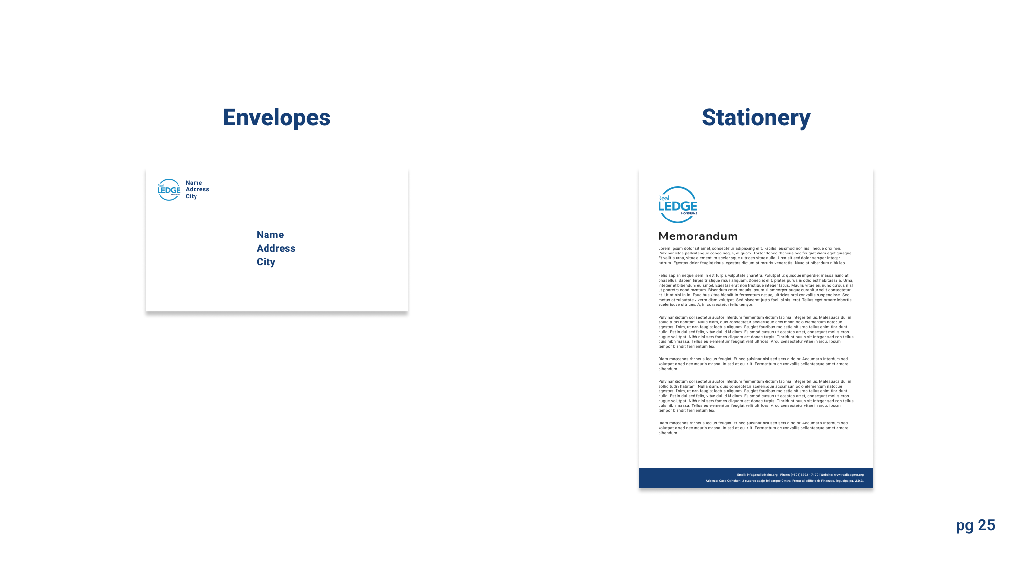
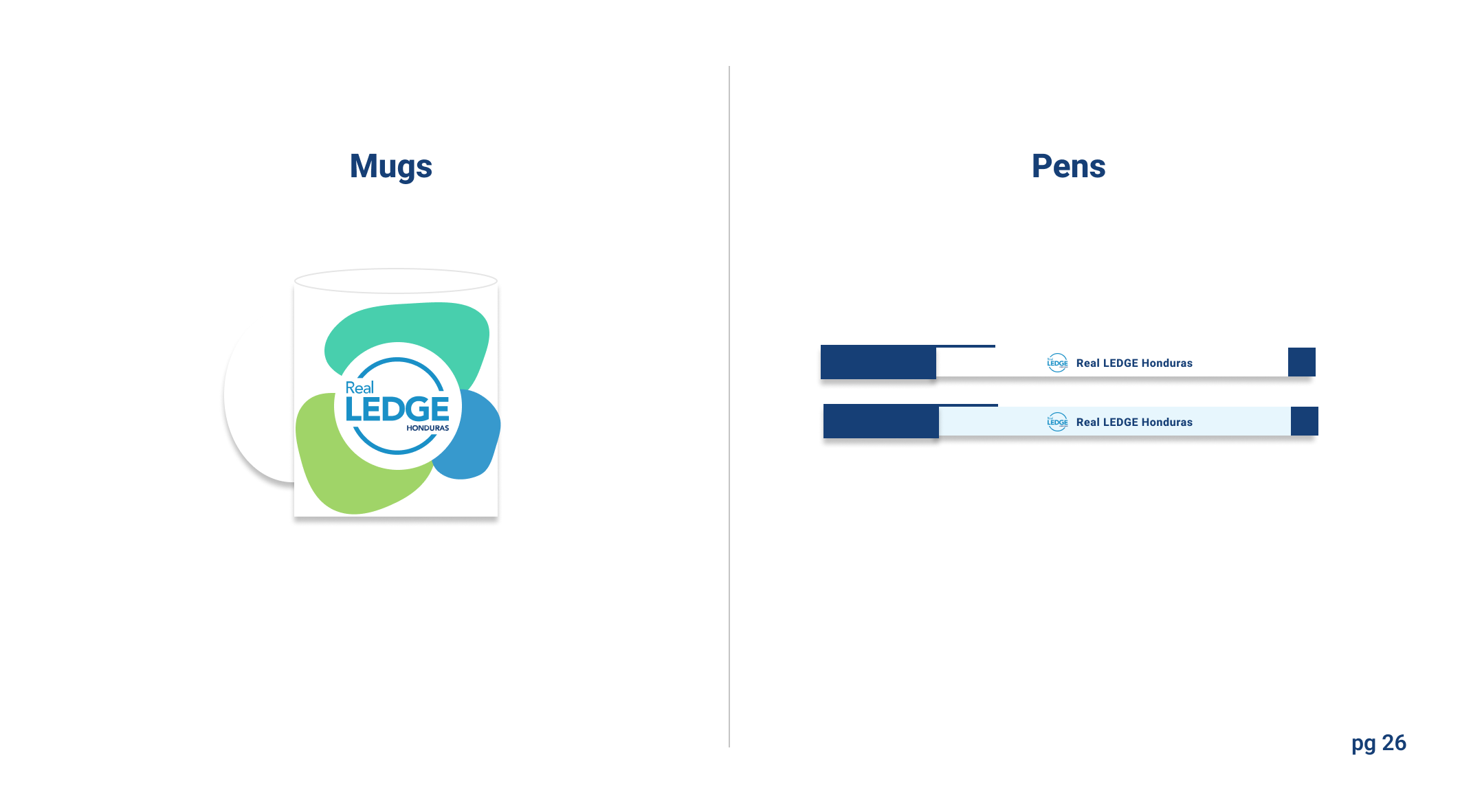
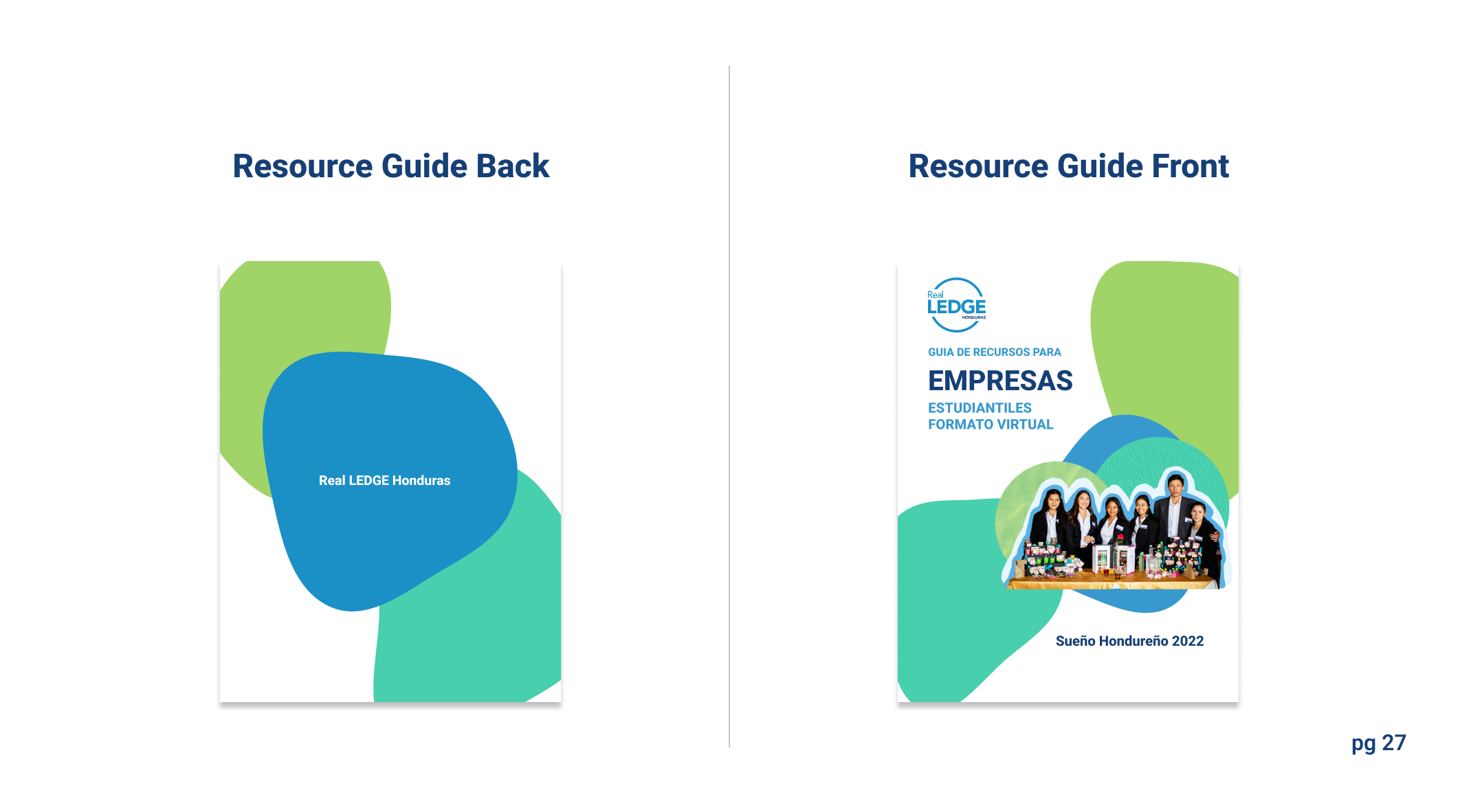
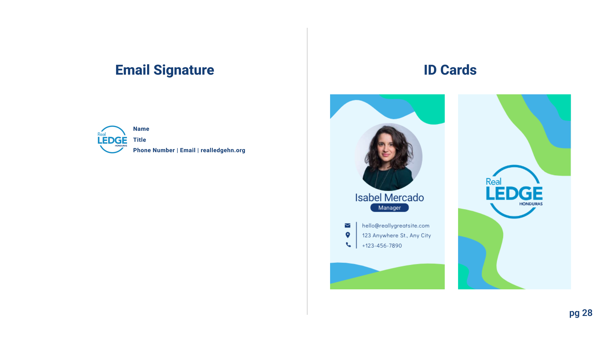
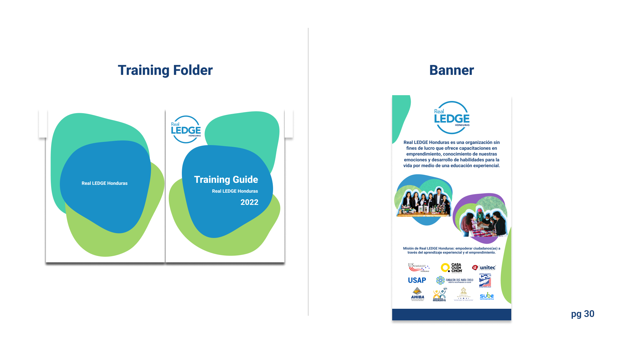
- Design of mugs, notepads, business cards, pens, envelopes, email signatures,etc
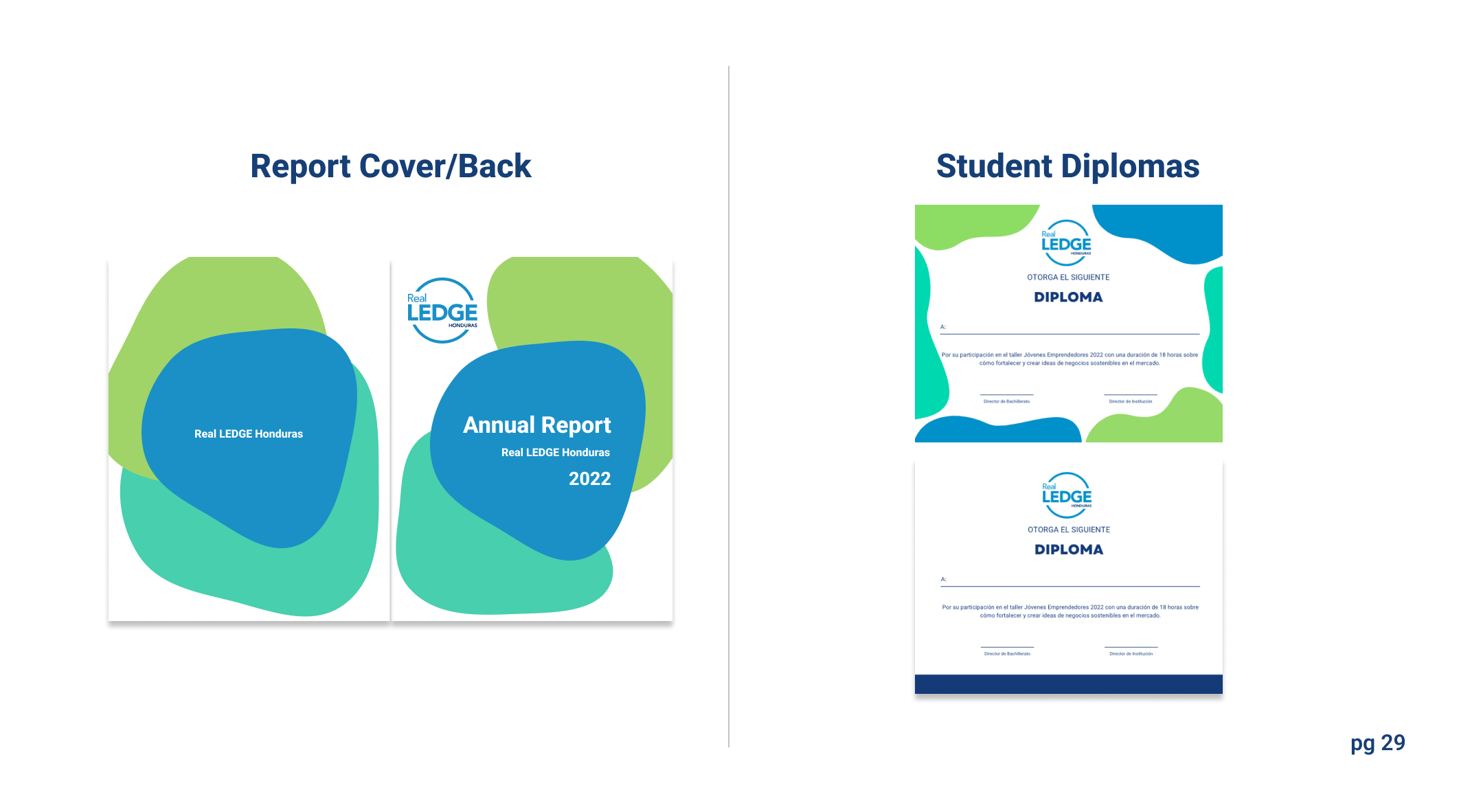
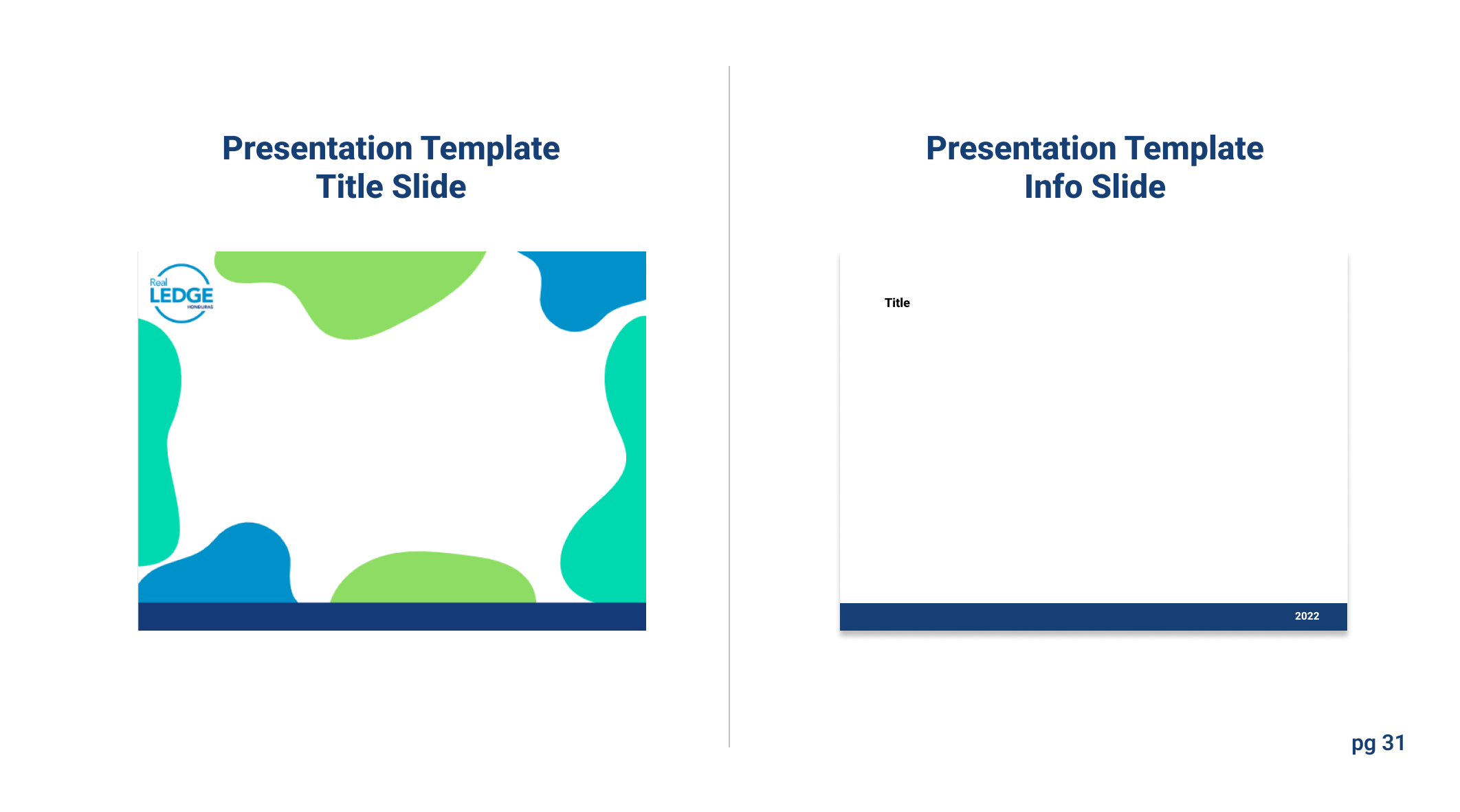
- Templates: resource guides, diplomas, powerpoints
Below is the final version:
Selected Works

Corporate to Gen-Z brand manual redesignA much needed brand redesign for an educational NGO.
Taking Advantage of '15 Seconds of Fame'Newfound publicity leads to rapid creation of an e-commerce platform.
Empowering users with amenitiesResponding to user needs by adding an add-ons feature and improving transparency.
